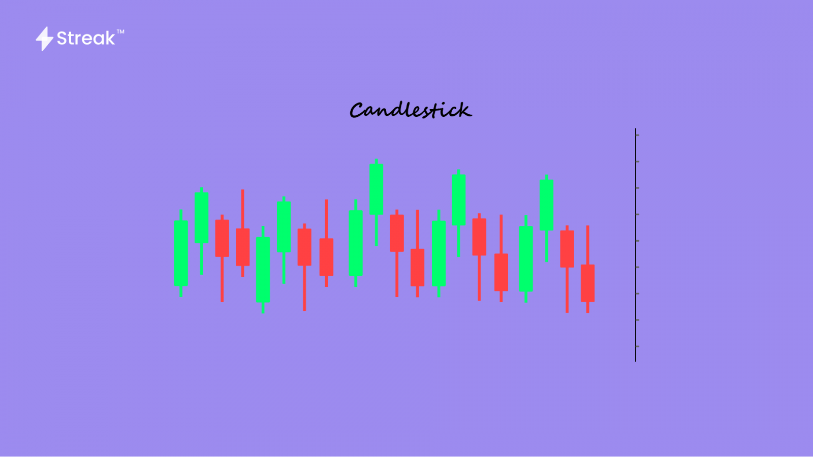
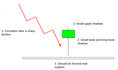
First of all, let’s thank the Japanese rice markets for giving us one of the most useful and handy ways to read a price chart – the candlesticks! They are called candlesticks because of the way the charts are represented by a rectangle with lines coming out of the top and bottom. This shape resembles a candlestick with a wick. The Japanese market watchers who used this style referred to the wick-like lines as “shadows.”
These charts provide a lot of information that a day trader can use while making trading decisions. Also, they are easy to read and interpret. Each bar includes the open, high, low, and close prices that occurred during a specific time interval.
If you have opted to trade at every 1-minute candle interval, a new bar is formed at the exact start of every minute. The charts show the direction of movement of the price. But more important;y, they show how much the price is moving at that particular time interval. In other words, the candlesticks show the current price as they’re forming. If you usually trade based on these actions of the price chart, then you are a price action trader.
Let’s look at each section of a Candlestick Bar!
- Open Price
The Open is the first price traded at that particular candlestick. The top or bottom of the candlestick body indicates the open price depending on whether the price is moving down or up respectively. If the price is moving up, the open price will be the bottom of the candlestick body. If the price is moving down, then the open will be the top of the candlestick body.
Also, if the price has moved up for that particular candlestick, then the candlestick will be green in color. If the price has moved down for that particular candlestick, then the candlestick will be red in color.
- High Price
The top of the wick above the body is the highest price that the stock achieved during any particular time interval. If the open or close was the highest price, then there will be no upper wick/shadow.
- Low Price
The bottom of the wick below the body is the lowest price that the stock achieved during any particular time interval. If the open or close was the lowest price, then there will be no lower wick/shadow.
- Close Price
The Close is the last price traded at that particular candlestick. The top or bottom of the candlestick body indicates the close price depending on whether the price is moving up or down respectively. If the price is moving up, the close price will be the top of the candlestick body. If the price is moving down, then the close will be the bottom of the candlestick body.
Also, if the price has moved up for that particular candlestick, then the candlestick will be green in color. If the price has moved down for that particular candlestick, then the candlestick will be red in color.
When the time period for the candle ends, the last price is the close price, the candle is completed, and a new candle begins forming.
Price Direction
You determine the direction of the price by studying the OHLC (open, high, low, close) and the color of each candle. During an uptrend, the candles will continuously be green in color while during a downtrend, you’ll see more and larger red candles as compared to the green ones.
Also, there are various chart patterns that traders have developed over years. Each particular pattern tells a different story Although, the interpretations are not completely true, they just come by a lot of times. To determine the direction of the price, you can also take the help of multiple time-frames strategy.
Price Range
The distance between the top of the upper shadow and the bottom of the lower shadow is the range of price moved through during the time interval of the candlestick.
You can also calculate it by finding the difference between high and low prices.
Final Thoughts
Candlestick charts are a powerful and efficient tool to view the price changes of a stock. Once you understand what each candlestick is indicating, you can start looking for trading opportunities. They are really popular because of their superior visual appeal. They offer much more information compared to a bar or line chart.


