Volume-by-Price is an indicator that shows the amount of volume for a particular price range, which is based on closing prices. Volume-by-Price bars are horizontal and shown on the left side of the chart to correspond with these price ranges. Chartists can view these bars as a single color or with two colors to separate up volume and down volume. By combining volume and closing prices, this indicator can be used to identify high-volume price ranges to mark support or resistance. StockCharts shows twelve Volume-by-Price bars by default, but users can increase or decrease this number to suit their preferences.
The volume price trend (VPT) indicator helps determine a security’s price direction and strength of price change. The indicator consists of a cumulative volume line that adds or subtracts a multiple of the percentage change in a share price’s trend and current volume, depending upon the security’s upward or downward movements.
Calculation
Volume-by-Price calculations are based on the entire period displayed on the chart. On a five-month daily chart, Volume-by-Price would be based on ALL five months of daily closing data, while on a two-week 30-minute chart, it would be based on two weeks of 30-minute closing data, and on a three-year weekly chart, it would be based on three years of weekly closing data. You get the idea. Volume-by-Price calculations do not extend beyond the historical data shown on the chart.
There are four steps involved in the calculation.
This example is based on closing prices and the default parameter setting (12).
1. Find the high-low range for closing prices for the entire period.
2. Divide this range by 12 to create 12 equal price zones.
3. Total the amount of volume traded within each price zone.
4. Divide the volume into positive volume and negative volume (optional).
Note that negative volume for a price zone is the sum of volume for all down days in that zone, while positive volume is the total of volume for all up days in that price zone.
VBYP – Spreadsheet
The example above shows a Volume-by-Price calculation taken for the Nasdaq 100 ETF from April 12th until September 15th, 2010. Closing prices ranged from 40.32 to 47.87 during this period (47.87 – 40.32 = 7.55). The one hundred and ten closing prices (one for each trading day) were sorted from low to high and then divided into 12 even price zones (7.55/12 = .6292).
VBYP – QQQ Example
The chart above highlights the first three price zones (40.32 to 40.95, 40.96 to 41.58 and 41.59 to 42.21). Starting from the low (40.32), we can add the zone size (.6292) to create the price zones leading to the high. Only prices that fall within these zones are used for that particular Volume-by-Price calculation.
VBYP – QQQ Example
The Volume-by-Price bars represent the total volume for each price zone. Volume can then be separated into positive and negative volumes. Notice that the Volume-by-Price bars on the chart above are red and green to separate positive volume from negative volume.
The volume price trend indicator is used to determine the balance between a security’s demand and supply. The percentage change in the share price trend shows the relative supply or demand of a particular security, while volume indicates the force behind the trend. The VPT indicator is similar to the on-balance volume (OBV) indicator in that it measures the cumulative volume and provides traders with information about a security’s money flow. Most charting software packages have the VPT indicator included.
Interpretation
Volume-by-Price can be used to identify current support and resistance levels as well as estimate future support and resistance levels. Price zones with heavy volume reflect elevated interest levels that can influence future supply or demand (a.k.a. resistance or support). Long Volume-by-Price bars underneath prices should be watched as potential support during a pullback. Similarly, long Volume-by-Price bars above prices should be watched as potential resistance on a bounce.
Price breaks above or below long Volume-by-Price bars can also be used as signals. A break above a long bar shows strength because demand was strong enough to overcome a supply overhang. Similarly, a break below a long bar shows weakness because supply was ample enough to overwhelm demand.
Trading With the Volume Price Trend Indicator
Signal Line Crossovers: A signal line, which is just a moving average of the indicator, can be applied and used to generate trading signals. For example, a trader may buy a stock when the VPT line crosses above its signal line and sell when the VPT line passes below its signal line.
Confirmations: The VPT indicator can be used in conjunction with moving averages and the average directional index (ADX) to confirm trending markets. For instance, a trader could buy a stock if the 20-day moving average is above the 50-day moving average and accompanied by rising VPT indicator values. Conversely, the trader may decide to sell if the 20-day moving average is below the 50-day moving average and the indicator’s values are falling.
The ADX also measures trend and momentum and can be used with the VPT indicator to confirm that a market is trending. ADX readings above 25 indicate that a security is trending, while readings below 25 indicate sideways price action. Therefore, a trader could buy when the ADX is above 25 and the VPT line is above its signal line. They could sell when the ADX has a value below 25 and the VPT line is below its signal line.
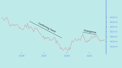
Divergence: Traders can use the VPT indicator to spot technical divergence. Divergence occurs when the indicator makes a higher high or a lower low, but the security’s price makes a lower high or a higher low. Traders should place a stop-loss order above the most recent swing high or below the most recent swing low to minimize risk.
Nuances
Before looking at some examples, it is important to understand how Volume-by-Price works. Volume-by-Price can be used to identify current support or resistance. Current bars should not be used to validate past support or resistance levels because the indicator is based on all the price-volume data shown on the chart. This means six months of data for a chart that extends from January to June. Bars may appear to identify support in March, but keep in mind that the indicator data extends well beyond March because the chart ends in June.
Chartists should also understand that big gaps can produce bars that equal zero. This makes sense because Volume-by-Price equals zero when there are no closing prices within a specific price zone.
Identifying Support
The chart for Netflix (NFLX) shows Volume-by-Price identifying support around 95-100 at the end of June. Notice that this is the longest bar. Also, notice that NFLX is beginning a pullback so we can use Volume-by-Price to estimate support shortly. The second chart shows NFLX with the yellow area marking Volume-by-Price support from the first chart. Support was expected in the 95-100 area and the stock reversed here in late July. Notice that volume surged in August to validate the reversal off of support.
Identifying Resistance
The chart for TE Connectivity (TEL) shows Volume-by-Price identifying resistance around 26-26.5 in early August. Remember, the April break above this bar is not a breakout because the current Volume-by-Price calculation extends from January to early August. The second-longest bar marks current resistance in the 26-26.5 area. TEL is at its make-or-break point with prices near resistance. The second chart shows Volume-by-Price resistance from the first and the ultimate failure at resistance.
Support Breaks
A break below the long Volume-by-Price bar signals increasing supply or selling pressure that can foreshadow lower prices. Long bars below prices show elevated interest areas and potential support. A break below this support zone signals a significant increase in selling pressure and lower prices are then expected.
The SanDisk (SNDK) chart shows a long Volume-by-Price bar marking support in the 39-43 area in mid-August. Also, notice that the stock forged at least three reaction lows around 42 from early July to mid-August. This support (demand) zone is marked. The second chart shows SNDK breaking below the previously identified Volume-by-Price support zone with high volume. Demand crumbled, supply won the day and prices moved sharply lower.
Resistance Breaks
A break above a long Volume-by-Price bar signals an increase in demand that can foreshadow higher prices. Long bars above prices mark supply overhangs that demand has not been able to overcome. A break above this resistance zone signals strengthening demand and higher prices are expected.
Sometimes chartists need to combine price action and Volume-by-Price to identify support zones and resistance zones. The Mcdonald’s (MCD) chart shows a long bar marking overhead supply between 60 and 61. The stock also met resistance between 61 and 62 with reaction highs in late April and mid-June. For support, the second and third-longest bars mark potential demand in the 57.5-58.5 area and the stock is near the late May low. Overall, a large Symmetrical Triangle could be forming on the price chart as MCD tries to hold above the late May low. The second chart shows MCD breaking resistance in July and surging to new highs in August.
Conclusion
Volume-by-Price is best suited for identifying present or future support and resistance. The indicator marks potential support when prices are above a long bar and potential resistance when prices are below a long bar. Chartists can enhance their analysis by looking at the positive (green) and negative (red) volume within the Volume-by-Price bars. Long green portions reflect more demand that can further validate support. Long red portions reflect more supply that can further validate resistance. It is important to confirm Volume-by-Price findings with other indicators and analysis techniques. Momentum oscillators and chart patterns are good compliments to this volume-based indicator.


